North Star has been selling their insurance policies through regional agents for the last 30 years. With many individuals resorting to doing most of their shopping online, the company wishes to attract a younger demographic by transitioning towards online direct sales.
Design a responsive, user friendly website that is optimized for ease and convenience when browsing and purchasing insurance products online.
Refresh the brand’s visual identity and create a modern logo to differentiate from competitors.
An easy to navigate digital experience that aims to make insurance understandable and appealing to the young consumers.The results will translate into expanding North Star’s customer base and increase customer satisfaction.
My understanding of insurance and how it is sold was average to low when beginning this project, so I began to frame questions and executed a research plan to better understand the industry and current industry trends. I wanted to know what the main driving factor for choosing an insurance provider is in order to translate concepts into features that addressed customer needs. I choose primary and secondary research methodologies to begin with.
Analyzing market trends and scoping the competitor field helped to form a better understanding of the current online insurance market landscape. I learned that there are three types of insurance: property, casualty, and health/life and that customer service reputation – not price – is the main factor driving the highest level of intent to renew with an existing carrier. A majority of insurance companies are aiming to market to young adults (18-25) by going digital, and creating a user friendly experience online.
I began the research by looking into North Star's competitors to analyze their strengths and weakness. The main competitors were Geico, Progressive, Liberty Mutual, Lemonade, and All State. I conducted 1:1 user interviews with four participants from the ages of 26 - 31 who have had some to minimal experience shopping for insurance.
The competitor analysis helped to assess what competitors are doing well and what features are missing or needed to insure customer satisfaction. The user interviews worked to highlight the customers main frustrations and motivations when searching for and purchasing insurance.
In conclusion the most common frustrations people face when purchasing insurance is not being entirely sure if they understood all the details about their policy or if they chose the best option to fit their needs. Another shared frustration experienced is using difficult to navigate website that makes filing a claim or viewing policies a time consuming task.
The research shows that features like low cost coverage, easy to access customer service, and a clear quote process with transparency about fees are what motivates customers to choose an insurance provider.
I created a persona and empathy map to illustrate a potential North Star customer. Creating a persona got me to what was actually needed to fit the North Star customer’s needs.
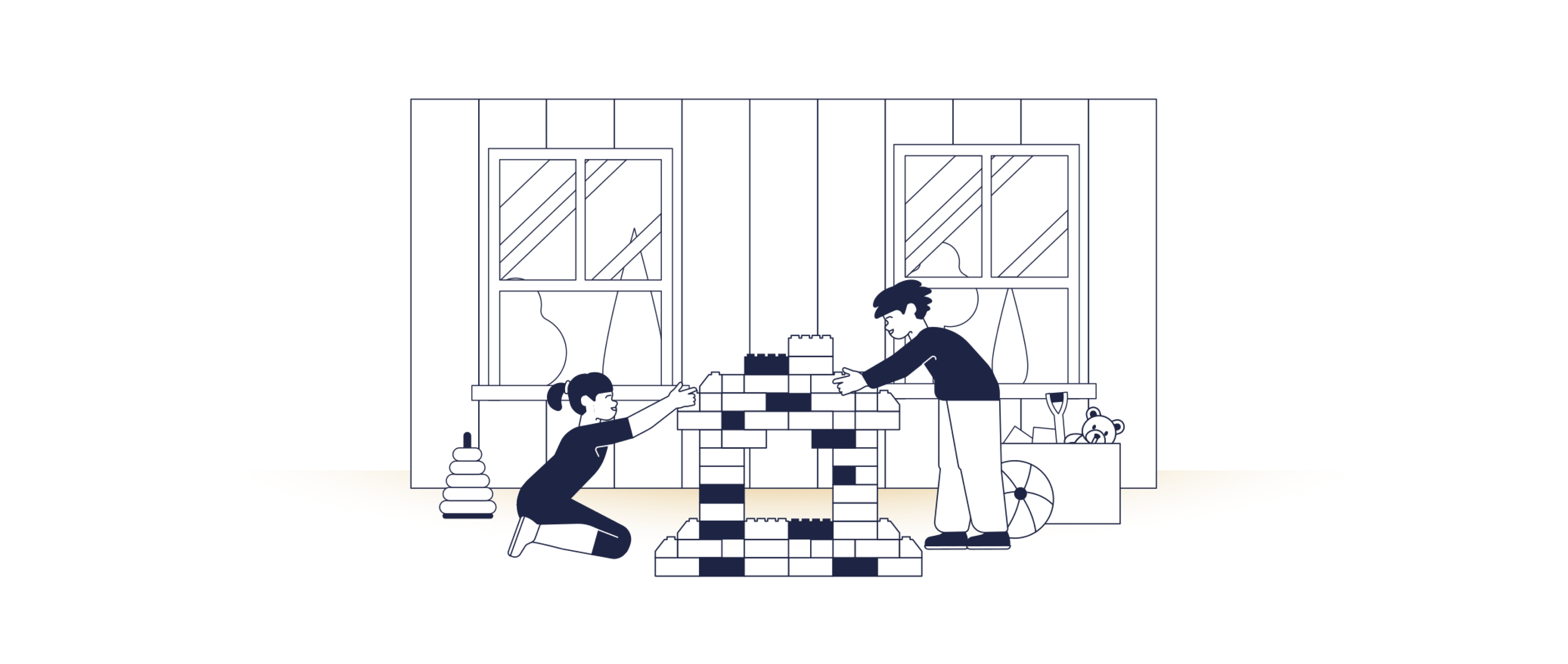
Albie is from Queens, NY, he lives with his three roomates and is a full time student studying Psychology. Albie’s school requires him to commute everyday, so he’s decided to purchase a car. Albie is currently searching online for an insurance provider to help cover his new car. This will be his first time purchasing insurance so he hopes to save time by finding a provider that can be straightforward about pricing and services on their site. Albie is motivated to find low cost coverage, but wants to make sure it’s the best option for his budget since he’s trying to save up.


At this point, all the research has helped me understand the different features and types of functions a potential user needs when purchasing insurance. I put together a list of features based on their level of importance. This helped me prioritize what needed to be included on the site's design.
MUST HAVE FEATURES:
• Login / Sign up
• Navigation Options
• Search Bar
• Products Menu
• Account /Privacy Settings
• Contact Us
• FAQs / Learn More Section
• Responsive site
• New logo
• File a Claim CTA
• Pay Bill / Autopay
• Manage Policy
NICE TO HAVE FEATURES:
• Customer Reviews / Testimonials
• Company About Page
• Filter and Customization
• Discounts and Special Offers
• Language Translator
CAN COME LATER:
• Social Media
• Blog
• Live Chat with Agent
• Mobile App
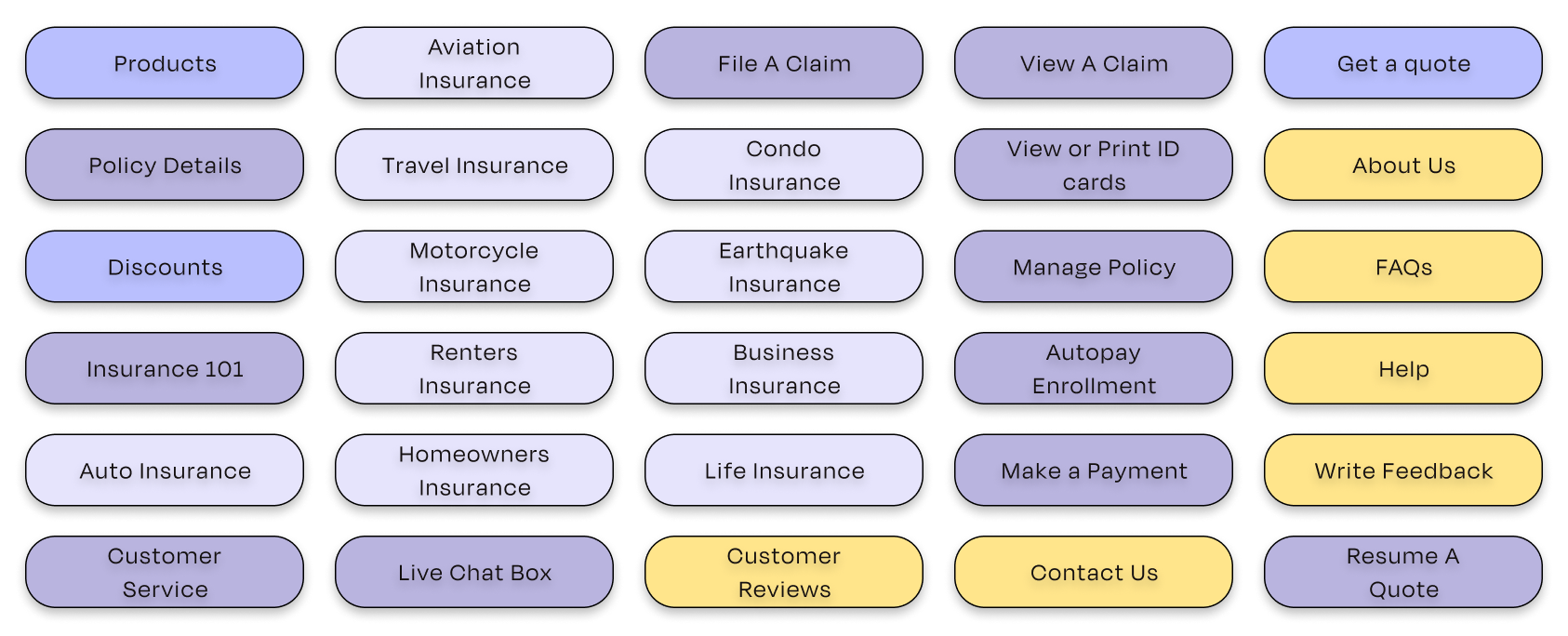
To understand how a user would classify and group information, I ran an open card sort via Optimalsort. 30 cards were given to seven participants to group and categorize and asked to give the categories a name. By analyzing the results I was be able to identify some commonly repeated patterns. The participants created a total of 18 categories with a median of 3 categories each. The main groups were My Account, Actions, and Help.
I used the results from the card sort as a guide when creating the sitemap. I laid out the site’s navigation menu and category pages. The different colors are meant to separate between the navigation, pages, and sub pages; the dotted line shows that a user can access help on any page through the site.

How might I guide potential users towards purchasing an insurance policy that best suits them? How would successfully guiding the user encourage them to set up an account with North Star and make them a returning and loyal customer?
The flows works to illustrate the alternative paths, key user actions, and decision points a user might face. It provides opportunity for the user to gather information on their own about the product they’re looking for, to then easily starting a quote through the site, to ultimately purchasing the policy.


I began this process by ideating on how the homepage would appear. I thought about the different design patterns to identify user interface navigation solutions that will meet user expectations and enhance customer satisfaction. After deciding on the best way to display content, I began to create low-fidelty wireframes for the homepage and quote popup window.

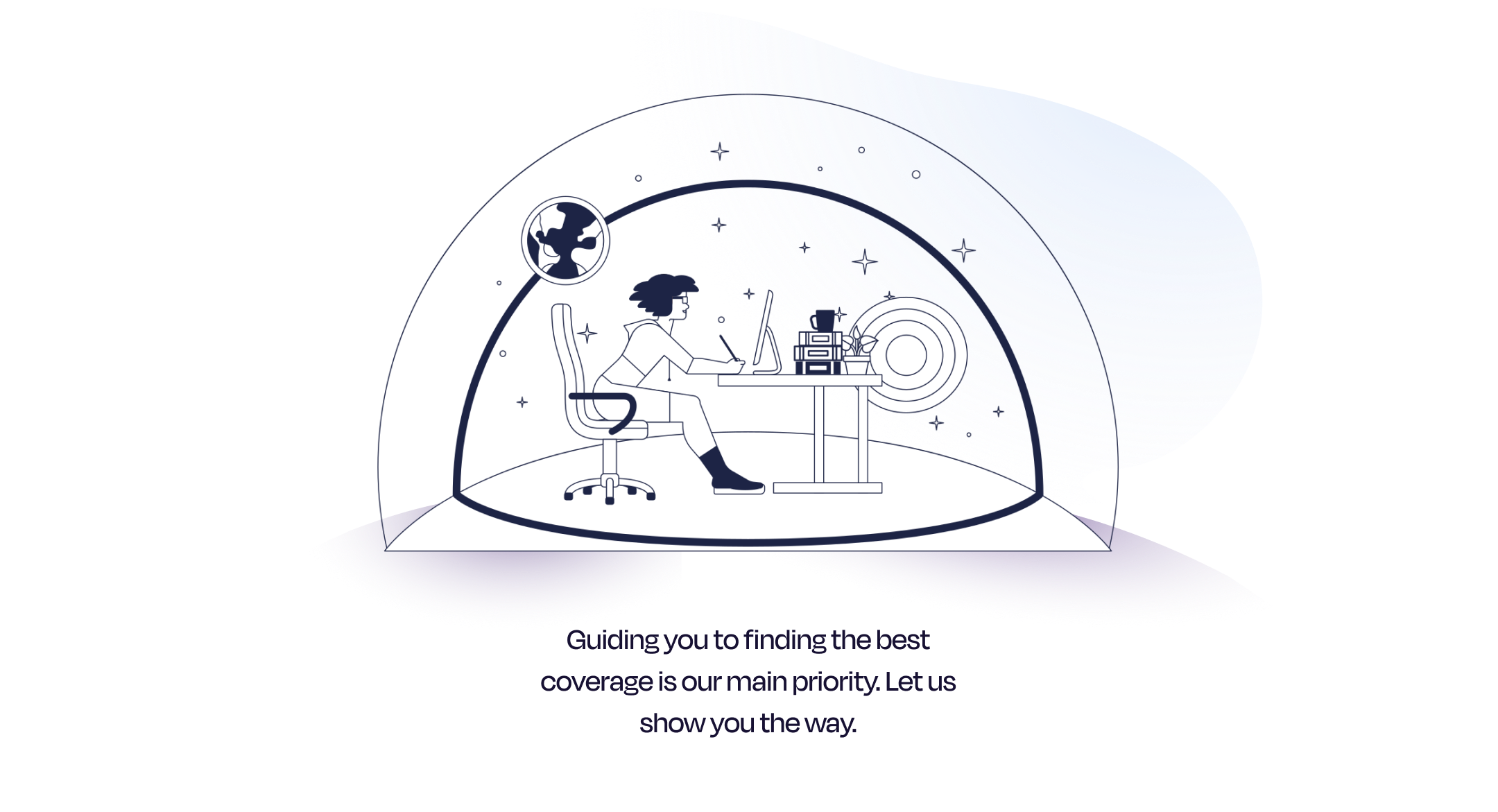
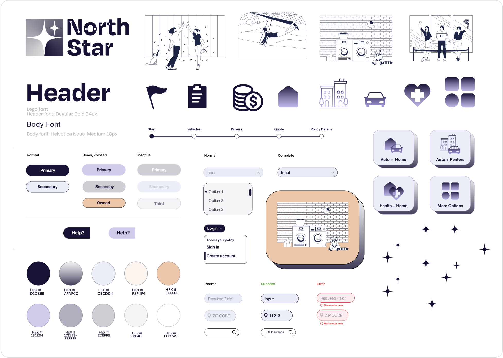
Once the foundation was set in place I started ideating on North Star's visual identity. Before coming up with the name for the insurance company, I had written down keywords that would help me to define the company's objective. The brand name was chosen to further express seeking guidance in a time of need.
I created an inspirational mood board to help visualize the brand's look and feel. I was inspired by astronomical illustrations and wanted a friendly, modern, and clean brand identity that would appeal to the young consumer market.
I used dark purple and tones of lavender as the primary colors paired with peachy and tan colors to create a calming yet welcoming appearance- two very important aspects that could appeal to a less experienced customer. I chose a graphically strong, clean and modern logo to evoke an image of boldness and to differentiate the brand from its competitors.
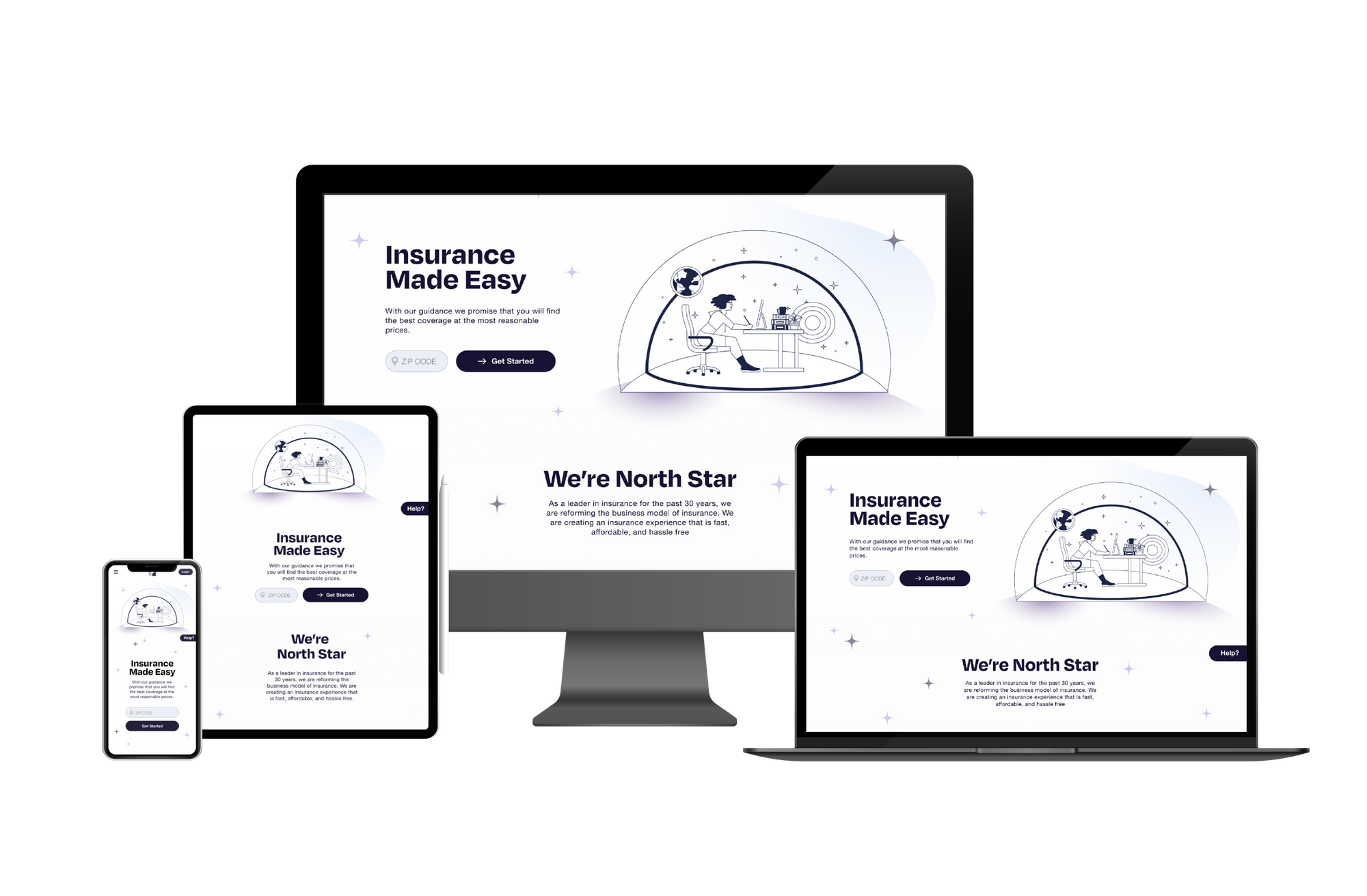
I compiled all the visual design elements and systems into a style guide and UI kit. With this, I designed a responsive homepage for desktop, tablet and mobile. The homepage allows a user to access other pages on the site, start a quote, read up on North Star and customer testimonials, and quick access to the claims center.

The final step for this project was creating and testing a prototype to better refine the product. I created a high-fidelity prototype on Figma with clickable buttons and page transitions to test the usability and functionality of the user flow. The main goal was to observe learnability and determine how easy is it for users to navigate through the homepage and products page, and quote process. It was also important to note any areas of difficulty when getting a quote such as entering information, getting through the steps, and selecting an insurance plan.
There were four participants in the North Star product usability testing. The tasks were to view products page and different coverage options, start a quote, and complete form to then checkout.
• All participants were able to finish the quote process successfully.
• All participants found the site to be straightforward and easy to navigate.
• All participants reacted positively to the branding and clean UI.
• All participants completed the tasks without any errors.
• 3 out of 4 suggested a variety of ways to improve the structure and phrasing within the quote process.
• Half recommended adding a price comparison list to show what benefits and discounts users come with specific type of coverage policy.
• 1 participant suggested tailoring the entire homepage just for new customers.

I gathered the insights and communicated findings from the usability tests and put together an affinity map with potential solutions. Prioritizing certain feedback to iterate and refine the prototype and test it all over again.
Top Priority Adjustments
• Design a price comparison list for the auto quote summary section
• Edit the flow of the quote process
• Rephrase customize your coverage section
• Add more information about the claims center for new users
• Eliminate find an agent button from both homepage and quote process


The most challenging and time-consuming areas of this project was conducting research and prioritizing information to deliver a smooth online experience.
I learned that meeting with people and utilizing their feedback was critical in identifying the main problems that come with shopping for insurance. If I could go back I would have spent more time creating UI elements to help educate the user on insurance. I was the most the most satisfied with the quote process, having a pop up window on the homepage keeps the process simple for the customer and makes it easily accessible.
Next steps moving forward would be to continue working on responsive mobile and tablet prototypes to reflect iterations from desktop website. Test the product again and implement design changes based off feedback.